18. February 2019

Comparing ages

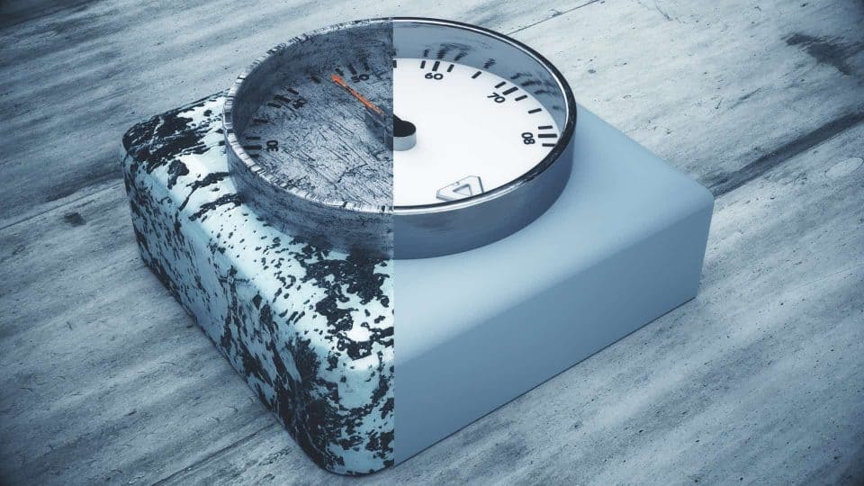
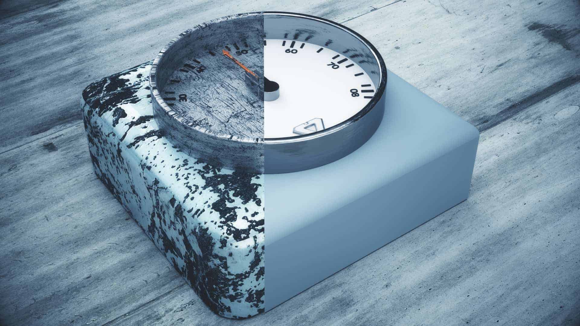
Hey Ho folks out there, it is me neo from neo3d art. In this post i will talk about the difference between one object in the same scene with the same light setup but… with different textures. We compare a simple clock. (Background of the story) I found this clock the other day in a forgotten box. The clock is almost 60 years of age and of course not that shiny anymore as it was back in the days. I did start to think … “What did it probably look like in the old days… new shiny and ready to be shipped… ?” Then i was wondering how it probably would look, if it was not hidden for years in that box but somewhere outside. Getting scratches and damages all these years. Wouldn’t it be cool to see both models compared to each other? That was the point when I […]
24. October 2018

end of the world

the concept for “the end of the world” was the first kind of concept which should be in parts. the first part was this ship, which seems to be at the end of the ocean of a flat world. Of course this is just art and should animate everyone to think of a kind of end. This brought me to part II. In part II i was thinking of a kind of industrial scene with big machines working at the border of the world, with a big city in the background. Also i added this small piece of nature in form of this tree. It stands for a kind of nature from the past. Important for me was the same camera angle like in the first part. This gives the viewer a fast look of “the same scene” just at another time. Feel free to comment and perhaps you have […]
6. October 2018

Another shot directly without filter

I am honestly amazed, what nowerdays render like my octane render are able to produce, when you just play with 3 things. Specular Light Colour Like i mentioned in my older article.”Always filter?” this setup is completly without any lights than the emission neon lights from the surrounding logos. For the specular i used the high polish black material on the “bugatti chiron” which let the light bounce several times and give this interesting mirror effect of the logos. I also decided to add another color, which is a kind of opposite of the harmoniously play between this black, neon white and blueish. As you can see i decided to make the brake disc in this high glossy red. This gives an effect of catching the eye for the viewers. And still no filter usage at all. What are your thoughts or experiences with setups like this? Leave a comment! […]
26. September 2018

Dance of the atmospheres.

This is a new concept i am working on. In this scene i try to let two totaly different colors dancing with each other. On the one site you got these warm and yellowish kind of colors, which stand for the sun and the warm feeling, but on the right site you got these technical colors which shine in more white, blue and green colors. They stand for a more technical atmosphere, mostly above 4000 kelvin up to 7000 kelvin. The more warm colors from the left came from 2400 up to 3000 kelvin. The dance of the two totaly different atmospheres take place in the golden ratio. I will keep on working and try to build more concept art, which everbody sees with different eyes. So keep on shining then cheers neo.